UNİKA Journal of Health Sciences Website
The corporate website of Karabük University's UNİKA Journal of Health Sciences. Issues, articles and journal statistics are pulled automatically from DergiPark, so the editorial team never has to enter content twice.
The problem it solves
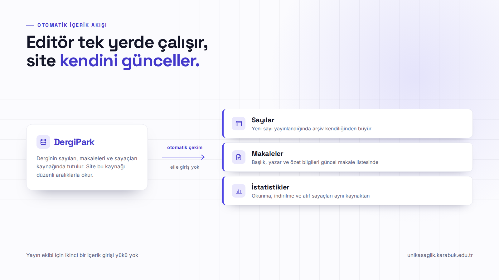
The most common problem with academic journal websites is that the site falls behind the journal. A new issue comes out and the site shows the old one for months; the number of articles grows while the figures on the home page stay where they were. The cause is usually not indifference but the fact that the content lives in two separate places: on one side the system the journal actually runs on, on the other a promotional site that has to be fed by hand. In this project I looked for the answer in connecting the content to its source rather than typing it in. The journal's issues, articles and counters continue to live on DergiPark; the site reads that source at regular intervals and updates itself. When a new issue is published the archive grows on its own and the list of current articles refreshes on its own. The editorial board never has to enter content on the site separately, and the site never falls behind the journal.
What it offers
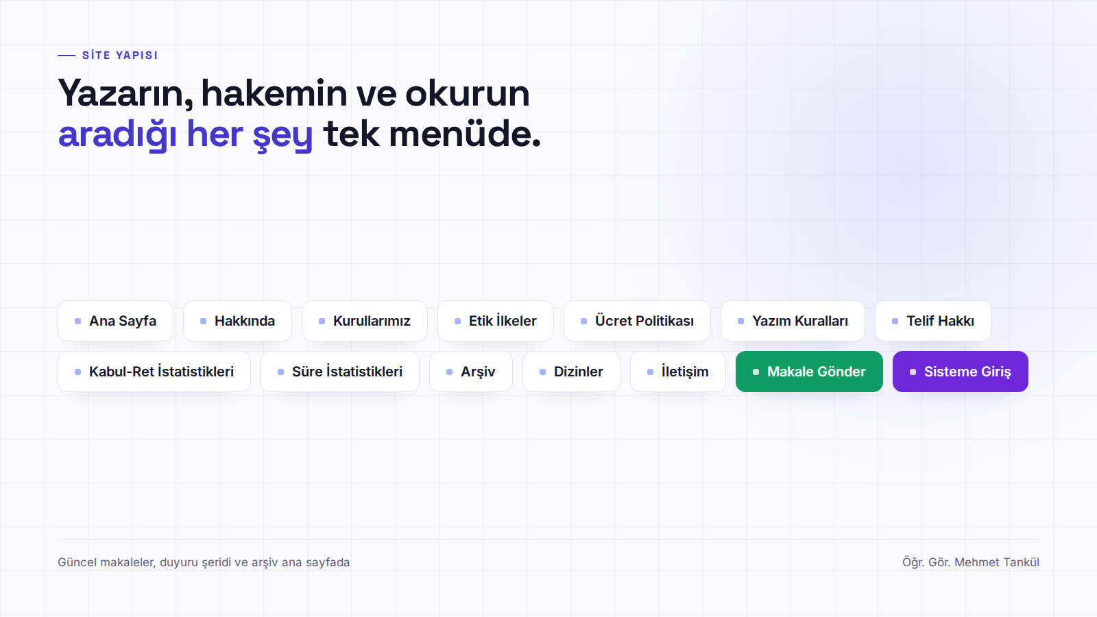
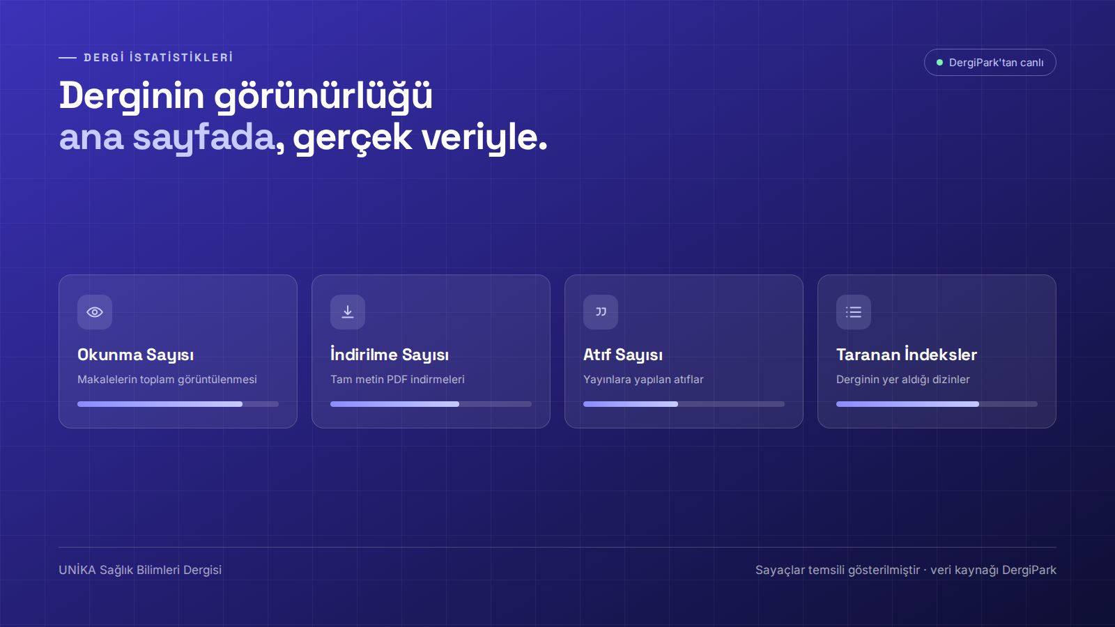
The home page was designed to do the three things expected of a journal site at once. At the top there is an announcement strip, where headlines such as a new issue, a call for papers, international indexes, a renewed board or referee applications are brought forward. Immediately below it sits the statistics area that shows the journal's visibility: reads, downloads, citations and the indexes the journal is listed in. These counters are not typed in either; they come from the same source, so the figure a visitor sees is always the real one. Further down the page, current articles are listed with title, authors and abstract. Everything an author, a referee or a reader needs was gathered into a single menu: About, Boards, Ethical Principles, Fee Policy, Writing Rules, Copyright, Acceptance and Rejection Statistics, Turnaround Statistics, Archive, Indexes and Contact.
Design and technical approach
For the design I chose a plain language befitting academic publishing. The palette is built around a single accent colour, the typography was chosen for readability, and the investment went into hierarchy rather than ornament — because on a site like this the visitor comes not to browse but to find one thing quickly. The article submission and login links are picked out in the menu in their own colours, so authors and referees see their own route the moment they arrive. The site was built mobile-first; a significant share of referees and authors look at it on a phone. The result is a corporate site that adds no burden to the editorial team, keeps itself up to date and reflects the journal's visibility accurately.
From the project